The origin story of this collection is special. Earlier this year, we surveyed over 1,000 women in our community about the way they want to feel when they run. Committed to designing for the feeling our community wanted most, we eagerly awaited the results, hypothesizing internally about what the answer might be. We had a hunch, and we were right. The resounding result? Strong.

But bringing to life that feeling? A harder task. Strength is an evolving idea in our community. It means different things to different women. We spent time exploring the subject with our community, our pros, with our muses, and with new partners in creation (meet Filippa!). The result - a set of symbols as deep and diverse as the definitions of strength. We’re proud to introduce to you, the Run Strong collection. A unique collection featuring the art of Filippa Edghilll, inspired by the strength of our community.
Three themes can be found throughout the designs: Bravery, Unity, and Individuality. Our fearless leader and lead designer, Sally Bergesen, shares how we brought these to life:


BRAVERY
Bravery is an entirely different notion of strength - celebrated best in the ‘Be Brave Get Ugly’ tank. First, it is the willingness to push one’s mind and body to a place it may have never gone. To the edges of ability. To reach out and feel those edges, and even push them further afield. Within that space, appearance is irrelevant. It's not possible to reach that place unless one is willing to let go of cultural norms of being "pretty" - and embrace the ugly. Although interestingly, in the end, we realize what is ugly is actually beautiful, as it expresses this extreme state of effort. Redefining beauty - for women - is a crucial pursuit. It takes work, and a lifetime, because it requires the constant and active questioning of dominant cultural norms. We have to call on intellectual acumen, analytics, and the awareness of unhealthy culture and media standards to get there. Ultimately, however, this engagement changes the standards - and then we're improving life for the girls and women coming up behind us. Kick down the doors...then call up the children!


UNITY
The collection also embraces the idea of women supporting other women. The symbol of clasped hands is all about our human connection. Not just friendship, but loyalty. The “I got you” moment that can come before, during, or after a shared experience. The gesture is strong - not the finger squeezing power clasp, or a business shake, this clasp is one that is best employed while hoisting your friend out of a burning building and onto a safe ledge. The dark skin, prevalent in much of Filippa's work, alludes to classic Greek sculpture that uses bronze, onyx, and other materials that patina to beautiful dark hues. As humans we crave connection to others. I can’t think of a more powerful visual to celebrate that!

INDIVIDUALITY
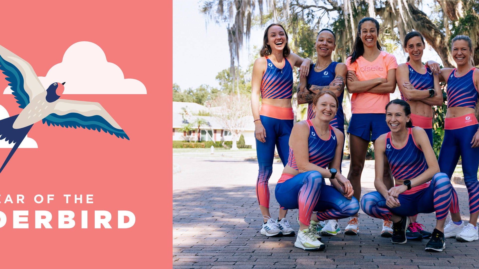
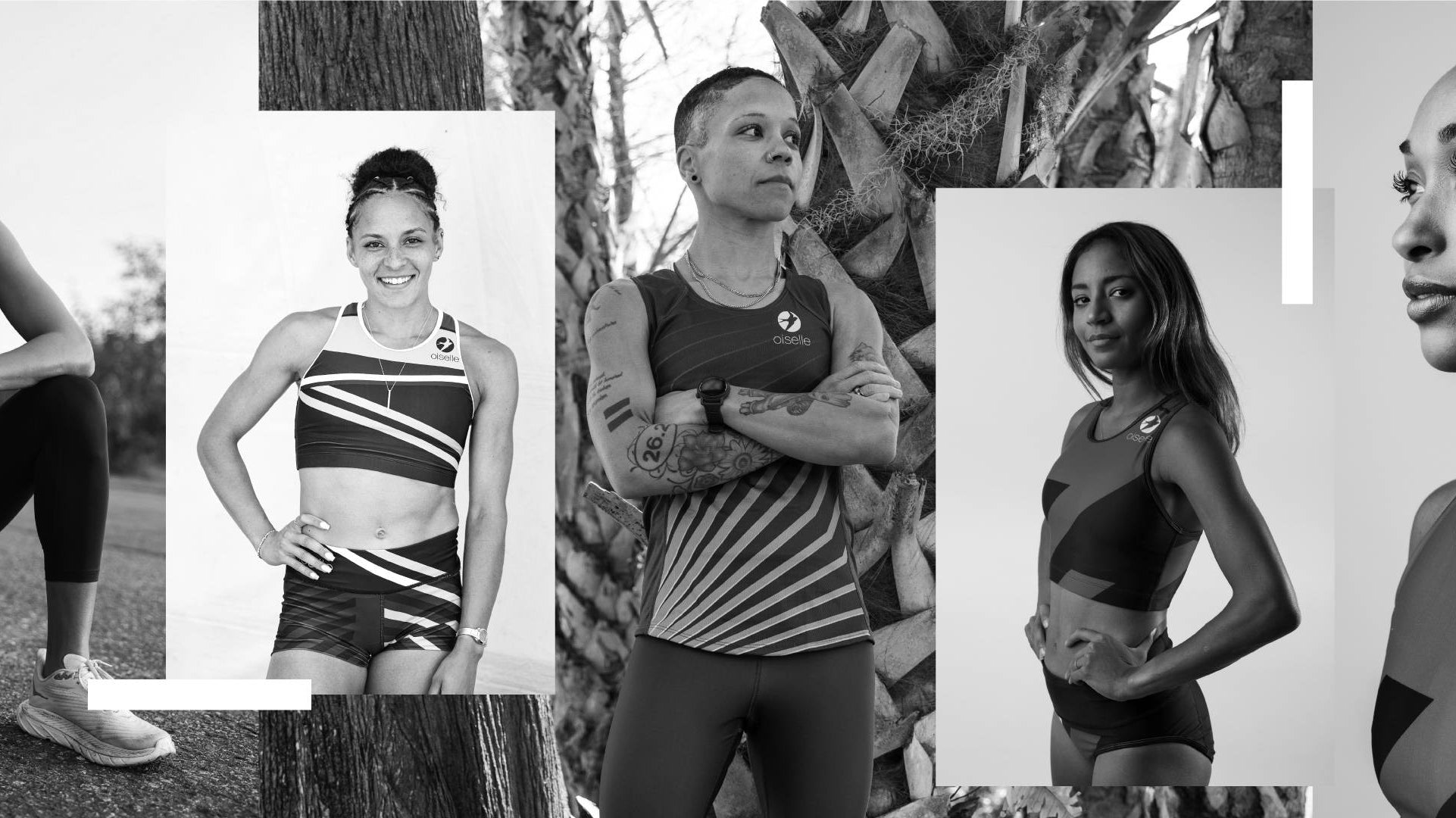
But within our community, strength also champions individuality. All the body shapes, types, and the eradication of the idea of a “ runner’s body.” This graphic also communicates the idea of a diverse but united team. Running is a safe space, where women come together to trust each other, trust themselves, and have the opportunity to be both vulnerable and strong. And to become strong by being vulnerable!
We can’t wait for you to see the designs in real life. They are even more stunning than you can imagine. And thank you so much for forever serving as our grand inspiration in our creative process.
Together in strength.


